About this Website
The typography and imagery for the RJAD Project website were carefully chosen for their thematic and historical meaning.
Typography
Typography is a subset of design that focuses on the appearance and arrangement of letters. Typography is how we communicate information visually, but it can also convey emotion, emphasis, and identity. Like any art, typography is not neutral. The three typefaces for the RJAD project have been chosen not just because of their visual effect, but because of who designed them and what they represent.
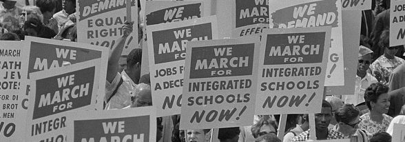
Signs carried by many marchers, during the March on Washington, 1963. Marion
S. Trikosko., photographer
S. Trikosko., photographer
Redaction

Image from redaction.us. Jeremy Mickel, Wilm Thoben, Graham Bradley, Zipeng Zhu / Dazzle
About Redaction
From the Redaction website
Redaction is a bespoke typeface commissioned by Titus Kaphar and Reginald Dwayne Betts’ The Redaction exhibition at MoMA PS1. The Redaction project seeks to highlight the abuses in the criminal justice system, in particular the way poor and marginalized people are imprisoned for failure to pay court fines and fees.
When Titus Kaphar and Reginald Dwayne Betts began their collaboration on The Redaction, they identified that typography should be an important extension of the work. Using legal documents from claims filed by the Civil Rights Corps as source material, Betts crafted new poems by redacting out superfluous information – text that is juxtaposed with Kaphar’s portraits of the individuals represented in the claims.
This emphasis on text and legibility presented a unique design opportunity: to create a bespoke typeface that could be used in the work, and also serve as a scalable tool to raise awareness of the project and reach even more people.
Designers
To fulfill the typographic potential of the project, Kaphar reached out to Forest Young, a colleague from Yale, now a Global Principal and Head of Design at Wolff Olins, who in turn recruited Jeremy Mickel, type designer and owner of MCKL.
Freight
About the Freight Collection
From the Freight Collection website
This is a collection of integrated typefaces ready to add unique style to any design project. What Joshua Darden started as a serif family inspired by the warmth and pragmatism found in 18th-century Dutch typefaces became The Freight Collection and now ranges across multiple weights, widths, and optical sizes — from Big, Display, Text, Micro, Macro, and Sans — all of which include companion italics. That’s 156 fonts that can be bold and daring just as easily as they can be quiet and unassuming.
Designers
Joshua Darden is an unassuming superstar in an otherwise homogenous discipline filled mostly with white men. According to the website Fonts in Use, he was the first African-American credited as a type designer.
Darden started his first type studio with friend Timothy Glaser in 1993, released the first five typefaces in the wildly popular Freight family in 2005, and in 2016 and 2020 he designed the logo typeface for Bernie Sanders’ presidential campaigns.
Bayard
Image from vocaltype.co. Designer Tré Seals.
About Bayard
From the Bayard page at Vocal Type
Bayard is a unique sans-serif typeface inspired by signs from the 1963 March On Washington For Jobs and Freedom.
Outside the March on Washington, [Rustin] Bayard was a close advisor to Martin Luther King and one of the most influential and effective organizers of the civil rights movement, leading a number of protests in the 1940s, 1950s, and 1960s, as well as a public advocate on behalf of gay and lesbian causes during the 1980s.
Bayard provided Martin with a deep understanding of nonviolent ideas and tactics at a time when he (MLK) had only an academic familiarity with Gandhi. Bayard was also instrumental in the formation of the Southern Christian Leadership Conference (SCLC), proposing to King in December 1956 that he create a group that would unite black leaders in the South who possess “ties to masses of people so that their action projects are backed by broad participation of people.”
Designers
Type designer Tré Seals founded Vocal Type in 2016. His bold typefaces are inspired by, among other things, historical protest signage from Civil-Rights era America, democratic student protests in China, clandestine newspapers printed by anti-fascist groups during WWII, and the designer’s personal history and experience with hand lettering, graffiti, and storytelling.
“Then one day, not soon after, I came across a record of the demographics of the graphic design industry, and for the life of me I can’t remember how (how I found it or why I went looking for it), but I did. And when I discovered that only 3–3.5% of all practicing designers in America are Black, and ±85% White (depending on the source), a lot of things started making sense. And I understood why everything looked the same.” –Designer Tré Seals